Visual Studio's Most Unusable Features
Dec 28, 2010
I use IntelliJ, TextMate and Visual Studio enough in the course of a week to make me seriously question my priorities in life. They all have their strengths and weaknesses. The only thing that really astounds me is how defensive programmers are about their tools - they all think theirs is better and that there's no way anyone sane could program with anything else. It's actually quite pathetic.
The other day I was installing MVC 3 RC2 for Visual Studio 2010 and was presented with a pretty poor user experience. It made me think of other examples of we don't give a fuck design I've encountered in VS over nearly a decade. Aside from the last item, all of these are mostly just funny.
8 - MVC 3 EULA
Some of you are going to point out that this thing is still in beta, which I admit. However, I'm always amazed at how some of these things seem to get worse over time. I mean, how do you get the EULA box wrong?
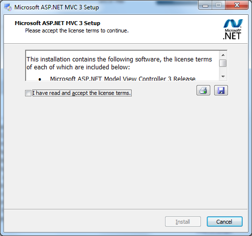
How does a job posting for that type of skill read? Experience making our legal crap even harder to read?
7 - Rename Dialog
Software companies are often accused of treating their users like idiots. It's a difficult line to walk. You'd think though that people who use a complex IDE are a little more savvy. Why is it then that every time you rename a file, you get this lovely prompt:
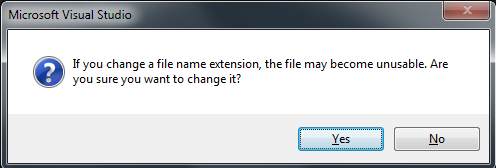
This to me is a perfect example of bad design. What percentage of renames in Visual Studio are accidental? I'd guess less than 1%. Rather than make the 99% case flow smoothly, they focus on the edge case.
6 - Add Reference
The Add Reference dialog has always been criticized for being really, really slow. Thankfully they fixed that in 2010. But there's another particularly you may or may not have noticed - the default sort order makes no sense:
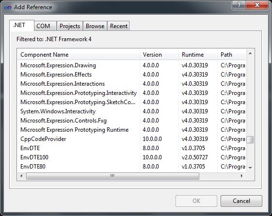
As far as I'm concerned, this is a brand new design paradigm - completely unique. The only thing I've managed to figure out about the default sort order is that it's useless. It's also deceiving. It looks like it's sorted by name (the entries you initially see are actually sorted by name), it's the first column, and heck, sorting by name makes a lot of sense. So when you're looking for System.Web.Mvc and enter something like "System.Web" no one would blame you for thinking it wasn't installed because you sure as heck aren't going to find it where you should.
5 - Empty MVC Project
This is one of my favorites. Recent releases of Visual Studio have included templates to start off with empty projects. The picture does more justice to this than I ever could:
4 - Fonts and Colors
This is one of three options dialog which drive me crazy. This is the best of the three, but it could still benefit from someone giving a fuck
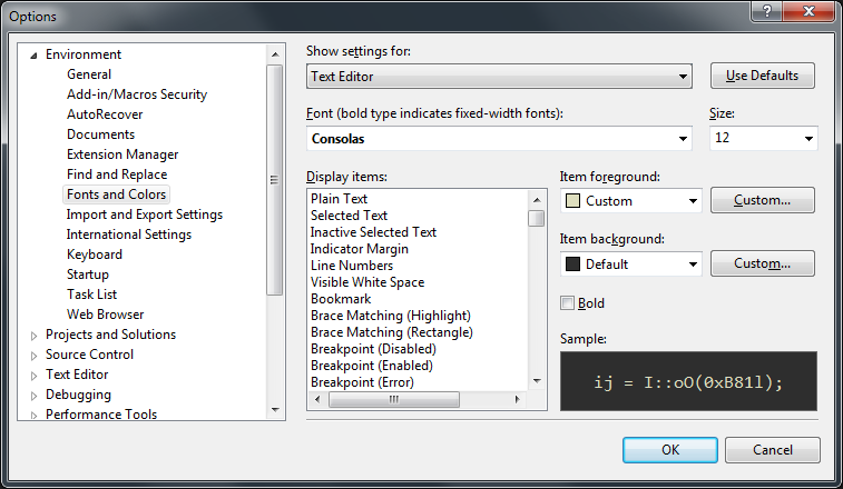
Like most options in Visual Studio, it doesn't support multiple character searching. You type the first letter and your own on your from there. What makes it hard to use though is that you generally have no idea what you are looking for. To make this useful, Microsoft should provide categories - because chances are the color I want to pick for keywords in C# is the same as for keywords in JavaScript, attributes in HTML, selectors in CSS and attributes in XML. Adding 6 or so global settings neatly available at the top would make the world of difference.
3 - Keyboard
Put the guy who came up with the functionality of Fonts and Color in the same room as the designer who did the EULA box and you end up with:
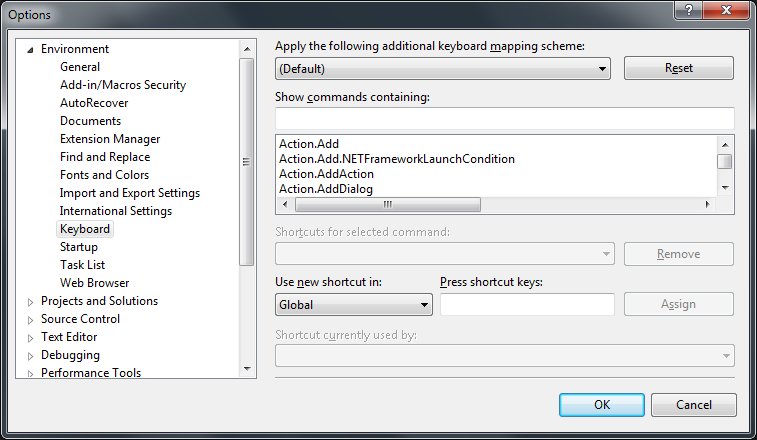
For those not familiar with it, there are a lot of choices in that four-at-a-time box. Probably hundreds. They did give us a search. Which can be effective, but when it isn't...
2 - Context Configuration
I'm a minimalist. I like things neat and clean. Visual Studio context menus take a different approach to life. The menus are bloated but what's even worse is the screen to configure the menus. Just to get to screen takes a bit of luck - right click on the right thing, pick the right menu, then the right tab, and then the right option. But then the menu itself:
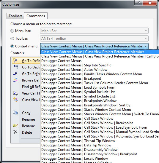
There are hundreds of context menus each with a ton of options. You can't even reposition items by drag and drop, you have to click the "move up" button 20 times. I don't use Visual Source Safe or Team Server. I don't for your crappy class diagram generators. I just want clean and simple menus.
1 - Add/Remove
The only issue that I consider truly serious in the list is what Visual Studio does to the Add / Remove list. Let's do a relatively straightforward install
Call me crazy, but I'd expect maybe 2 or 3 things added to my add/remove list. I mean, all I want in C#, right? Apparently, I'm wrong:
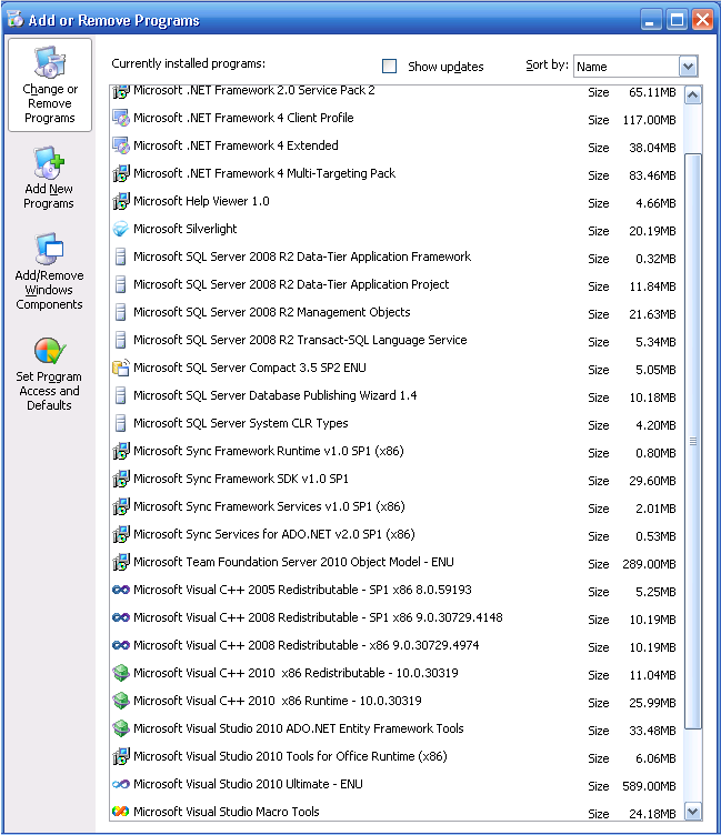
Why do I need SQL Server stuff? Team Server? Sync? Silverlight? I don't. You can safely uninstall all of them (VS will give a bunch of warnings next time you startup, but they can be ignored). That's just with C# selected, try picking C# and Visual Web Developer and you'll around 30 installed items. I had a connect issue open for this with constructive (as well as not so constructive) feedback. But I can't find it, and it was closed as "Won't fix" anyways.
Yes, Help (F1) should have made the list...but 2010 moved that ever so slightly in the right direction.